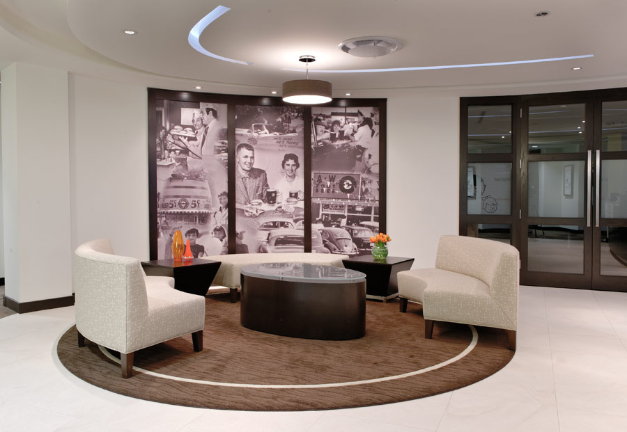
A&W is an established and nationally recognized restaurant franchise, yet the head office needed to integrate brand identity, new department layouts and a stronger alignment with the company culture.
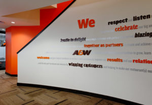
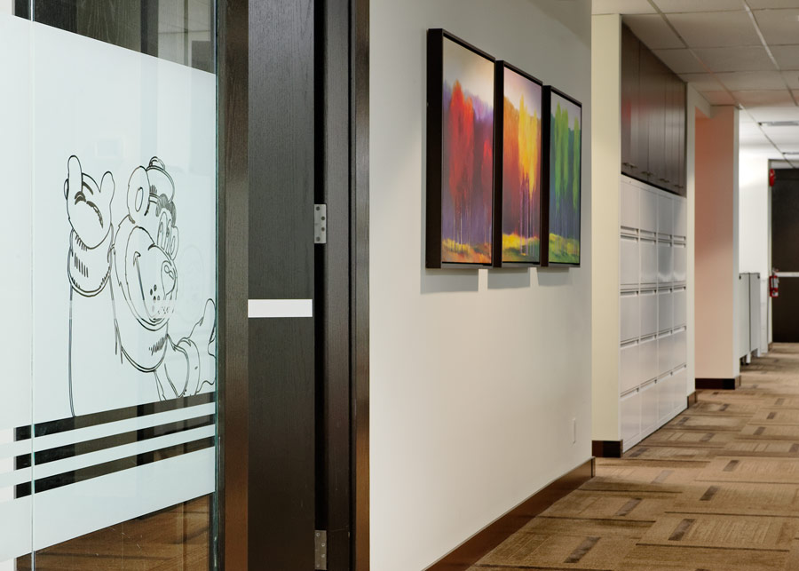
To support their culture of openness, respect and teamwork, we aligned collaborating departments for efficient integration. We also opened corridors, and added glass panels for a welcoming environment to both staff and guests. Meeting rooms were dispersed equally throughout for all to share. The staff lounge gave honor to personal time with proximity to windows and privacy from the office work buzz.
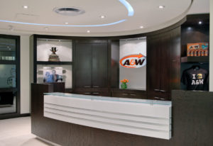
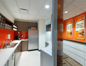
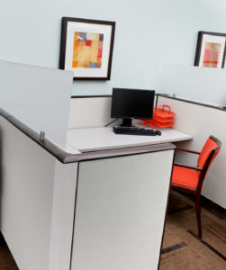
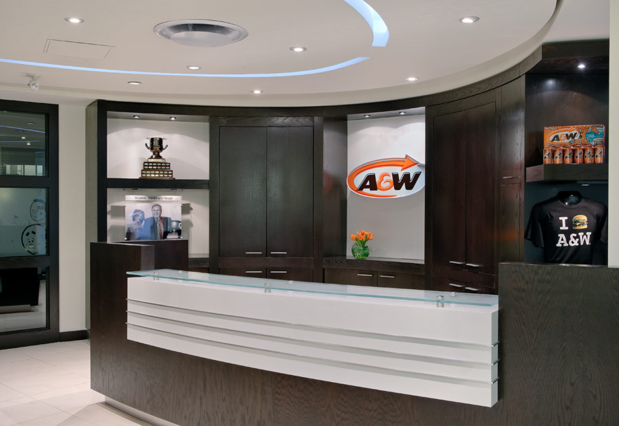
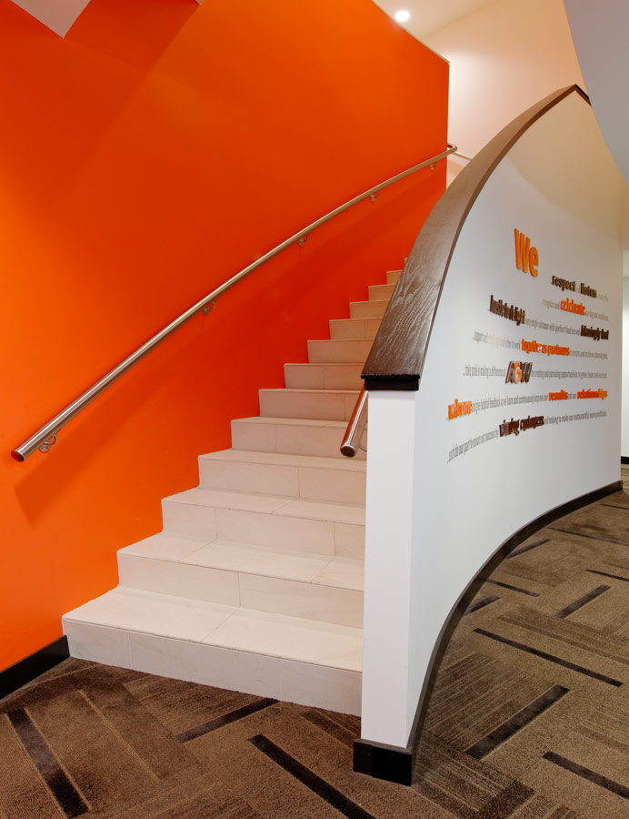
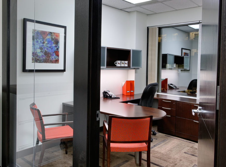
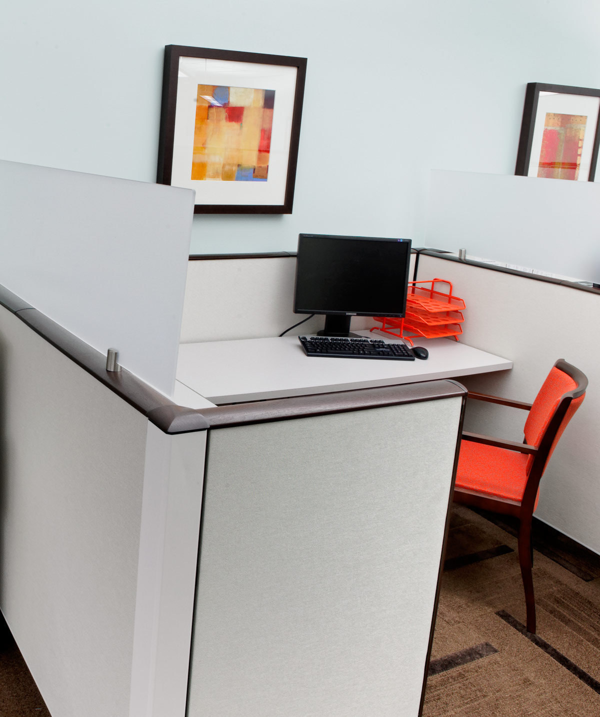
Interior design incorporated some of the restaurant’s brand identity of playful, nostalgic elements combined with a refined manner to suit the professional environment. The familiar dark brown became the cabinet stain and textured carpet throughout, contrasting sharply with crisp white walls and workstations to evoke a sense of order and polish. At the same time, deep orange and sky blue colours became feature walls, chair seat fabric and backsplash tiles to stimulate playful creativity. Curved walls mimicked the company logo, while animated silhouettes on office windows signified the root beer, onion rings, hamburgers and other icons of A&W.
Stats:
- Tenant Improvement: 13,000 sq ft
- Design and Construction Timeline: Full Renovation 2007; Updated changes 2010.
- Interior Design Services: Programming, Design Concept, Design Development and Construction Documentation, Permits and Tender, Furniture Layouts and Specifications, Contract Administration.
- Project Team: SSDJ (during employment), Fusion Projects Ltd.


Photography: Nick Didilick
